
This is not a well planned, elaborate مضمون on accepting change and what we can do to make it better. This is a series of thoughts, سوالات and sarcastic تبصرے taken mostly from messages between link and link about why we are not شائقین of the Facepop Makeover of July 2010. If آپ would like to read an مضمون about accepting the change, exploring some of the finer parts of the makeover and moving on, please read link مضمون سے طرف کی Fanpop's amazing link. Actually, آپ should probably read that anyway if you’re at all concerned about the makeover.
A BRIEF HISTORY LESSON.
One of the things Missy and I have always loved about Fanpop is that it was… well, Fanpop. (Most of) the people were great, lots of cool content, the creators were down to earth guys who actually talked to the users and cared about what they had to say (I still love آپ guys even though I hate this new layout with a fiery passion!). It had a nice, simple, clean layout. It was original, not like most of the up-and-coming sites that are essentially ripoffs of مزید مقبول sites like MySpace and Facebook.
We’ve been here since 2007. Some call us “the old people”. We are not normally شائقین of change. But before آپ write this off with a “Oh great, it’s just Missy & Dasm bitching about the smallest change again,” please at least skim this article. I may be a bit biased, ‘cause I helped write it, but I believe there are some interesting points below.
LADIES & GENTS, I GIVE YOU... FACEPOP. (Or: THE WALL)
There was a repeat pick in the Fanpop spot the other دن about whether Fanpop یا Facebook was better. Fanpop has won every one of those picks! There is a message in that.
Aside from the fact that walls are thought of as a Facebook thing, this is going to open up a world of pain, as trolls and spammers can now abuse whole spots and individuals much مزید easily now.
I think almost everyone can agree that the دیوار box is ridiculously large. Downsize, please.
Why didn't the site test the feature on a small group first, so that issues like expanding تبصرے and the رپورٹ function could already work before releasing it to everyone?
Yes, it has been asked in the past and the slight majority wanted something similar to a wall. One thing that needs to be taken into account is that the people who wanted "comment walls" and such were the same people who wanted personalized backgrounds for their profiles etc. Those were the same kind of users who just wanted it to be all sparkles and hearts like their MySpace accounts.
THE LAYOUT.
Despite hiding half the features & content, the new layout makes the pages look so much مزید cluttered. جنک, فضول like مقبول content and the mind-blowing four ڈیٹس اپ are all on the right side while everything else is overlapped on the left.
No لنکس on the main page of a spot? And مضامین way down the bottom of the page where no one will look? Great.
فورم were already ignored, now they're basically useless. Older users will still know their purpose, and hopefully where to find them, but why would a n00b post a فورم for discussion when there's a gigantic دیوار they can write on, right on the spot's ہوم page?
This screws over quizzes, too - forget that whole 'I'm here for a purpose, but ooh, I know the answer to that کوئز 'cause it's right there where I can see it!' thing. This was one of Fanpop’s coolest features and now it’s hidden just like ویڈیوز and forums.
...but سے طرف کی all means, put the جوابات section right where everyone can see it, it's not abused سے طرف کی 98% of the site یا anything.
After trying for ages to get it drilled into the heads of uploaders, even putting a note on the لوڈ اپ page itself, about adding تصاویر with link, guess what? Image names don't دکھائیں up on a spot's ہوم page.
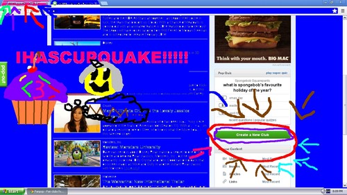
THREE SEARCHBARS in a spot?! THREE searchbars for people to ignore?! The placement of the new تلاش bar commands مزید attention, so I can accept that. But THREE searchbars per spot?! (Black Bar of Doom for site-wide searching, Grey Bar for spot, and now another spot تلاش in spots that don’t have دیوار posts yet.)
What determines مقبول content? Personally, I've never paid any attention to it and now it's taking up half my page.
It seems that most of the spots I checked that have no quizzes have the 'quizzes' tab shown in default instead of the 'picks'. What determines which tab is shown on individual pages?
Putting مضامین all the way down at the bottom and the "wall" up the سب, سب سے اوپر functions to totally devalue article-writing while promoting Twitter like "Oh LOlz i ? FanPOp!!!!!!!1" contributions. It will also probably scare off potential new users over the age of 12. Nobody loves a crazed fangirl.
USER پروفائل CHANGES.
"Club Activity" is a pain in the پچھواڑے, گدا to navigate through. With the old system, once آپ were in a user's activities, it only took a click to get where آپ wanted. Why did that get مزید complicated?
The link to سہارا on the پروفائل header is gone, now the only way to get to them is to click the سہارا شبیہیں یا go through the wall.
...but there is a link to "photos" which leads to -waitforit- the user's gallery. Which can also be accessed سے طرف کی clicking "more photos" اگلے to the user's icon, the شبیہ itself, یا the tiny thumbnails of other شبیہیں in the user’s gallery.
In order to get to the picks a person has made, آپ now have to go through the picks section in the "my club activity" menu (instead of being able to see it from the 'activity' section).
As of now, I haven't found out how to find the کوئز سوالات a user has made through navigation (other than just typing it in the ایل آر یو bar). The کوئز page allows آپ to sort the quizzes the user has taken, but nothing on the ones they made.
Each user now has link on their page for "updates" which only leads to the ہوم page. The status bar looks like it's going to take آپ to the ڈیٹس اپ for the spots the users is a part of (fanpop.com/fans/username/updates/filtered), but last I checked, آپ could only see your own updates. Which would be why it's redirecting to the ہوم page. Also, why would آپ need to see the ڈیٹس اپ for someone else's spots?
THE BURNING QUESTIONS.
Why has this kind of "makeover" been دیا priority over other issues such as the repeated failures of the reporting system, the عمومی سوالات that hasn’t been updated in ages, the insanity of the duplicate spots issue, and the tons of worthwhile suggestions in Dave’s link?
A BRIEF HISTORY LESSON.
One of the things Missy and I have always loved about Fanpop is that it was… well, Fanpop. (Most of) the people were great, lots of cool content, the creators were down to earth guys who actually talked to the users and cared about what they had to say (I still love آپ guys even though I hate this new layout with a fiery passion!). It had a nice, simple, clean layout. It was original, not like most of the up-and-coming sites that are essentially ripoffs of مزید مقبول sites like MySpace and Facebook.
We’ve been here since 2007. Some call us “the old people”. We are not normally شائقین of change. But before آپ write this off with a “Oh great, it’s just Missy & Dasm bitching about the smallest change again,” please at least skim this article. I may be a bit biased, ‘cause I helped write it, but I believe there are some interesting points below.
LADIES & GENTS, I GIVE YOU... FACEPOP. (Or: THE WALL)
There was a repeat pick in the Fanpop spot the other دن about whether Fanpop یا Facebook was better. Fanpop has won every one of those picks! There is a message in that.
Aside from the fact that walls are thought of as a Facebook thing, this is going to open up a world of pain, as trolls and spammers can now abuse whole spots and individuals much مزید easily now.
I think almost everyone can agree that the دیوار box is ridiculously large. Downsize, please.
Why didn't the site test the feature on a small group first, so that issues like expanding تبصرے and the رپورٹ function could already work before releasing it to everyone?
Yes, it has been asked in the past and the slight majority wanted something similar to a wall. One thing that needs to be taken into account is that the people who wanted "comment walls" and such were the same people who wanted personalized backgrounds for their profiles etc. Those were the same kind of users who just wanted it to be all sparkles and hearts like their MySpace accounts.
THE LAYOUT.
Despite hiding half the features & content, the new layout makes the pages look so much مزید cluttered. جنک, فضول like مقبول content and the mind-blowing four ڈیٹس اپ are all on the right side while everything else is overlapped on the left.
No لنکس on the main page of a spot? And مضامین way down the bottom of the page where no one will look? Great.
فورم were already ignored, now they're basically useless. Older users will still know their purpose, and hopefully where to find them, but why would a n00b post a فورم for discussion when there's a gigantic دیوار they can write on, right on the spot's ہوم page?
This screws over quizzes, too - forget that whole 'I'm here for a purpose, but ooh, I know the answer to that کوئز 'cause it's right there where I can see it!' thing. This was one of Fanpop’s coolest features and now it’s hidden just like ویڈیوز and forums.
...but سے طرف کی all means, put the جوابات section right where everyone can see it, it's not abused سے طرف کی 98% of the site یا anything.
After trying for ages to get it drilled into the heads of uploaders, even putting a note on the لوڈ اپ page itself, about adding تصاویر with link, guess what? Image names don't دکھائیں up on a spot's ہوم page.
THREE SEARCHBARS in a spot?! THREE searchbars for people to ignore?! The placement of the new تلاش bar commands مزید attention, so I can accept that. But THREE searchbars per spot?! (Black Bar of Doom for site-wide searching, Grey Bar for spot, and now another spot تلاش in spots that don’t have دیوار posts yet.)
What determines مقبول content? Personally, I've never paid any attention to it and now it's taking up half my page.
It seems that most of the spots I checked that have no quizzes have the 'quizzes' tab shown in default instead of the 'picks'. What determines which tab is shown on individual pages?
Putting مضامین all the way down at the bottom and the "wall" up the سب, سب سے اوپر functions to totally devalue article-writing while promoting Twitter like "Oh LOlz i ? FanPOp!!!!!!!1" contributions. It will also probably scare off potential new users over the age of 12. Nobody loves a crazed fangirl.
USER پروفائل CHANGES.
"Club Activity" is a pain in the پچھواڑے, گدا to navigate through. With the old system, once آپ were in a user's activities, it only took a click to get where آپ wanted. Why did that get مزید complicated?
The link to سہارا on the پروفائل header is gone, now the only way to get to them is to click the سہارا شبیہیں یا go through the wall.
...but there is a link to "photos" which leads to -waitforit- the user's gallery. Which can also be accessed سے طرف کی clicking "more photos" اگلے to the user's icon, the شبیہ itself, یا the tiny thumbnails of other شبیہیں in the user’s gallery.
In order to get to the picks a person has made, آپ now have to go through the picks section in the "my club activity" menu (instead of being able to see it from the 'activity' section).
As of now, I haven't found out how to find the کوئز سوالات a user has made through navigation (other than just typing it in the ایل آر یو bar). The کوئز page allows آپ to sort the quizzes the user has taken, but nothing on the ones they made.
Each user now has link on their page for "updates" which only leads to the ہوم page. The status bar looks like it's going to take آپ to the ڈیٹس اپ for the spots the users is a part of (fanpop.com/fans/username/updates/filtered), but last I checked, آپ could only see your own updates. Which would be why it's redirecting to the ہوم page. Also, why would آپ need to see the ڈیٹس اپ for someone else's spots?
THE BURNING QUESTIONS.
Why has this kind of "makeover" been دیا priority over other issues such as the repeated failures of the reporting system, the عمومی سوالات that hasn’t been updated in ages, the insanity of the duplicate spots issue, and the tons of worthwhile suggestions in Dave’s link?


This doesn't apply to all of آپ and i respect everyones views, however i feel that some users just moan at any little change even if its good and some users saying they preferred fanpop beta. I know that there hasn't been much change but the users against change is the reason why.
Why do some users hate change? They think its against the 'spirit' of fanpop, they're scared that it will turn fanpop into myspace; Them reasons make me laugh. One, what the hell do آپ mean against the spirit! Fanpops not christmas. Two, how the hell could fanpop possible turn into myspace with all the awesome spots?

How can آپ not love the emotes? It makes it easier to see how the user are talking, it makes the تبصرے مزید creative and there just fun. The speech bubble is good to, less boring then the تبصرے before.
I'm sure this مضمون will get a bad rating, but i just needed to say this.
Why do some users hate change? They think its against the 'spirit' of fanpop, they're scared that it will turn fanpop into myspace; Them reasons make me laugh. One, what the hell do آپ mean against the spirit! Fanpops not christmas. Two, how the hell could fanpop possible turn into myspace with all the awesome spots?
Emotes Are Fun & Useful
How can آپ not love the emotes? It makes it easier to see how the user are talking, it makes the تبصرے مزید creative and there just fun. The speech bubble is good to, less boring then the تبصرے before.
I'm sure this مضمون will get a bad rating, but i just needed to say this.


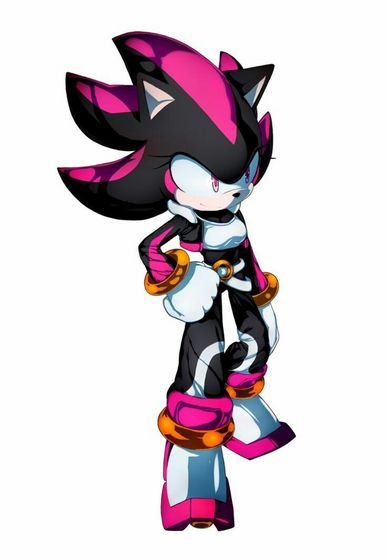
Hold his پسندیدہ red chaos مرکت, ایمرلڈ
As he held himself from a cut on his arm
Some of Shadow own blood add dropped
Onto the red chaos مرکت, ایمرلڈ making it glow bright red
Out of a flash of like گلابی light
A female version of shadow who add different quills form
Shadow but she was midnight black hot گلابی
Markings on her quills arms and legs
Hot گلابی round her light گلابی eyes
Ice white ice blue inhibitor ring like zero the hedgehog
With the ASAKURA Royal family crest on it with matching hover shoes like zero
Shadow was in shock looking at the young hedgehog
She beautiful thought shadow as he blush گلابی
End of part 1 🌼
seeing things looking at shade
but no shade is very real
were did آپ come from shade ask shadow
SKYRO a FUTURISC world of the gods
I was in a pod at the time
wen the red chaos مرکت, ایمرلڈ with 1 of your quills
on it glow bright
I ask my mom dad if I CUD be your
life mate they کہا yes I am your gift shadow
so wen your red chaos مرکت, ایمرلڈ with
1 of your quill connected together
sent me here to آپ in this timeline shadow
what do آپ mean this timeline ask shadow
I come from 2000 years silver timeline کہا shade
shadow nod as he اقدام over to shade
they chat shade دیا shadow a hug
ask wood he like to be like him
shadow کہا yes
end of part 3